TalkMaze |
Case Study
Crafting a versatile Student-Parent Dashboard to accommodate all of TalkMaze's features and necessities.
I worked collaboratively with a team of UX/UI designers in pursuit in designing a parent-student dashboard to tailor to parents and students who shared their utmost concerns with struggling to really know if TalkMaze’s services were impacting their children’s development and growth with public speaking. While TalkMaze did propose to have our team design a parent-student dashboard, we had to dig deeper into adding core features to the portal that are needed to contribute to parent satisfaction and student success.
Team |
Heather Nguyen | Brenton Chou | Ana Pinto | Nicole Nguyen
Timeframe |
3 week Sprint
My Role |
UX/UI Designer
Programs Used |
Figma, FigJam, Procreate
Client: TalkMaze |
I was granted the opportunity to work with an amazing team for our client, TalkMaze. TalkMaze is a service that helps students find confidence through virtual public speaking. Its mission is to inspire positive change in students and unlock their limitless potential. The company is dedicated to providing students worldwide with the tools and skills needed to communicate effectively and make a significant impact by speaking out.
Design Problem |
How might we create a simple, but also immanency functional dashboard for both parents and students, empowering such users with easy access to resources for a richer experience with TalkMaze's services?
Target Audience |
Parents and Students
Design Solution |
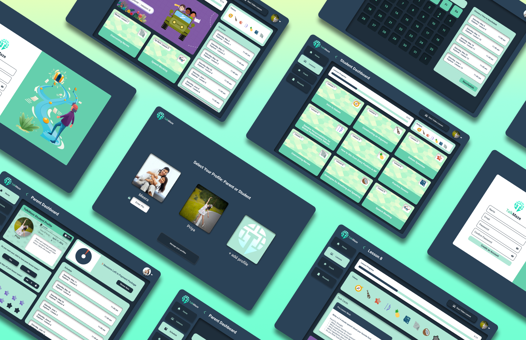
Our team worked with the CEO and Staff of TalkMaze to develop a parent-student dashboard featuring important elements of consideration for parent and student concerns with their enrollment with TalkMaze. By implementing essential elements, that are referenced from outsourced platforms and services, we are able to compile all of these features onto one platform for easy accessibility. improved efficiency, enhanced engagement, and streamlined communication.
Try out the Dashboard for yourself!

Design Process |
Discovery [ User research | Competitive & Comparative Analysis - Heuristic Analysis of Current Standing Sites ]
Define [ User Persona ( target audience(s) ) ]
Ideate [ Initial Ideas | Task Flows | Information Architecture ]
Design [ Typography | Design Consistency | Low-Fi Wireframes | Mid-Fi Wireframes | Hi-Fi Wireframes | Final Screens ]
Insights [ Challenges | Learnings | Findings | Reflection | Next Steps (phase 2) ]
Discovery
Discovery
User Research |
Before getting into the nitty-gritty, and diving deep into designing our dashboard, our team went through all of the provided data and information with what TalkMaze had provided for us. We looked through their past and current curriculum, its structure, and any specific features that are on the high-priority list for our team to be specifically featured during the dashboard development. During our first stand-up with the company, we developed questions for specific information that we wanted further context and explanation for. We also wanted to see what were the primary features that were absolutely needed based on what the company’s input was.
Here we have concluded these features that were considered for our dashboard after our initial stand up with the CEO of TalkMaze.
Competitive & Comparative Analysis
- Heuristic Analysis of Current Standing Sites |
Our team also analyzed potential competitors taking into account what they have done well and what to avoid when analyzing their interfaces. What we took reference of, is what each site has done fairly well in ranging from site intention, organizability, and how certain features were implemented into these unique educational platforms.
One competitor that I took reference from was NovaKid. This site had most of the features that TalkMaze has outsourced from.
User Interviews |
Our team had the pleasure of interviewing a total of 6 people for our research.
3 Current Parent Users
2 Prospective Student Users
1 Current Student User
Insights |
When sorting stickies in our affinity map for patterns, here are some shared main concerns and statements that were presented to us.
I feel uninformed about my child's learning with TalkMaze ( 3 of 5 Adult Users ).
I want more information when scheduling a coach ( 3 of 5 Adult Users ).
Define
Define
User Persona |
Using all the data we gathered from our affinity map, my teammate Heather and I collaborated to create our User Persona. During our drafting stage, we shared the same concept of having our primary persona be a concerned parent despite having a balanced ratio of student-to-parent interviewees. But, our parent interviewees, according to our data, seemed to share more concerns that assisted into backing up the need for certain features to enhance their child’s experience with TalkMaze.
Ideate
Ideate
Initial Ideas | Task flow draft
We had a standard dashboard idea of having it be able to do all.
Design
Design
Sketches |
Everyone on the team’s sketches were considered during the ideation process of lo-fi wireframing sketches
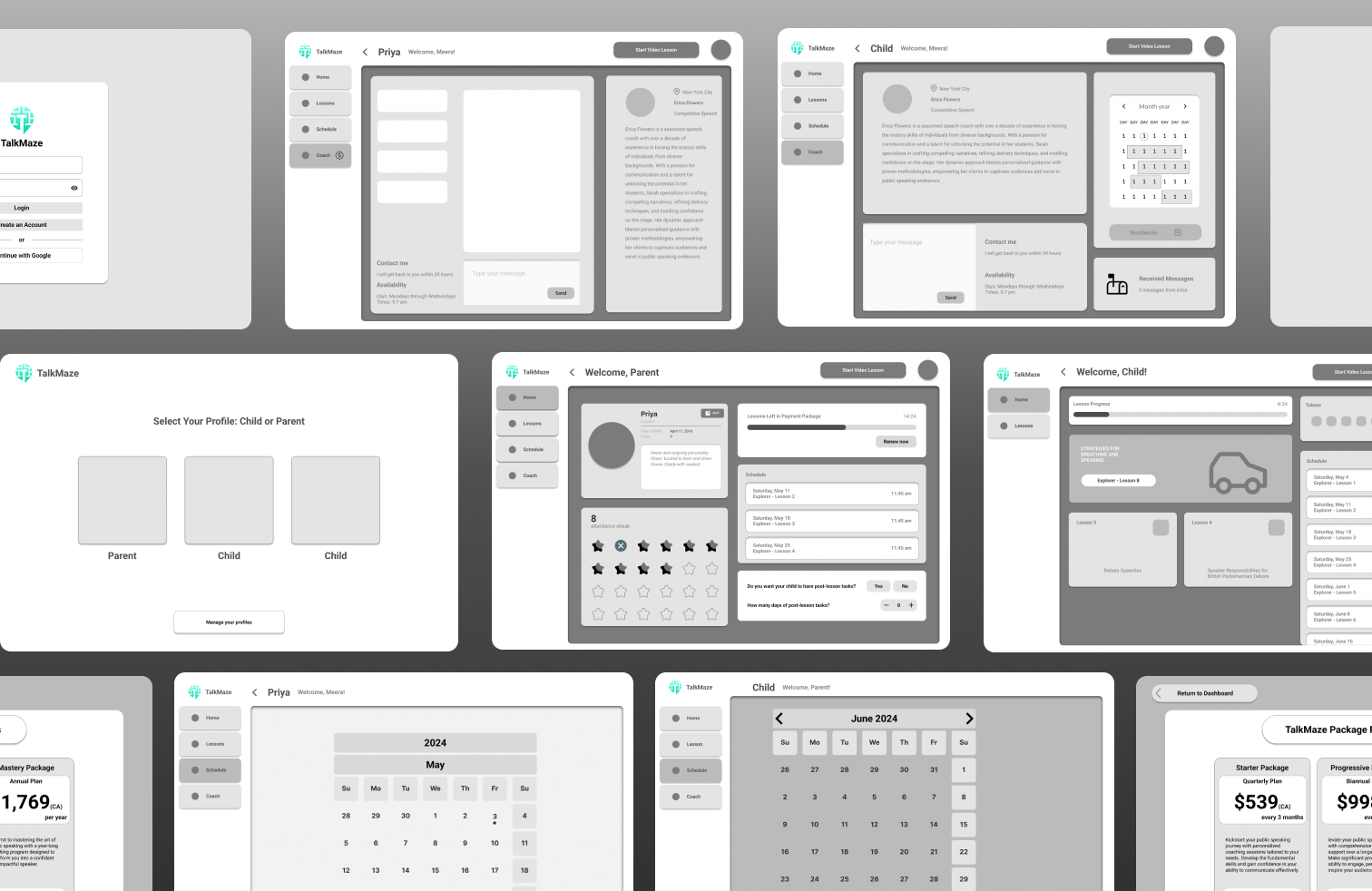
Lo-Fi Wireframes |
During the development of the lo-fi wireframes, our team explored various layouts and brainstormed how certain features would move on to hi-fi. There were many components moved around to different sections

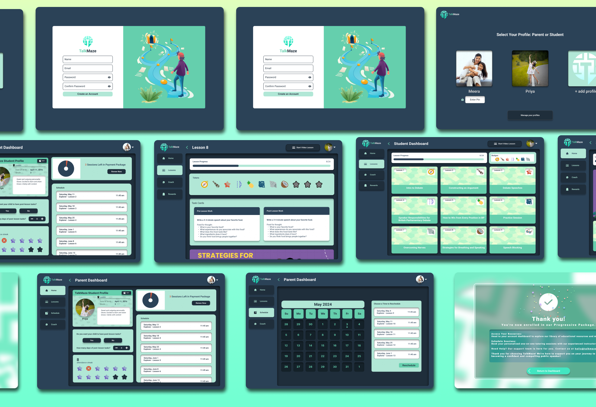
Hi-Fi Wireframes |
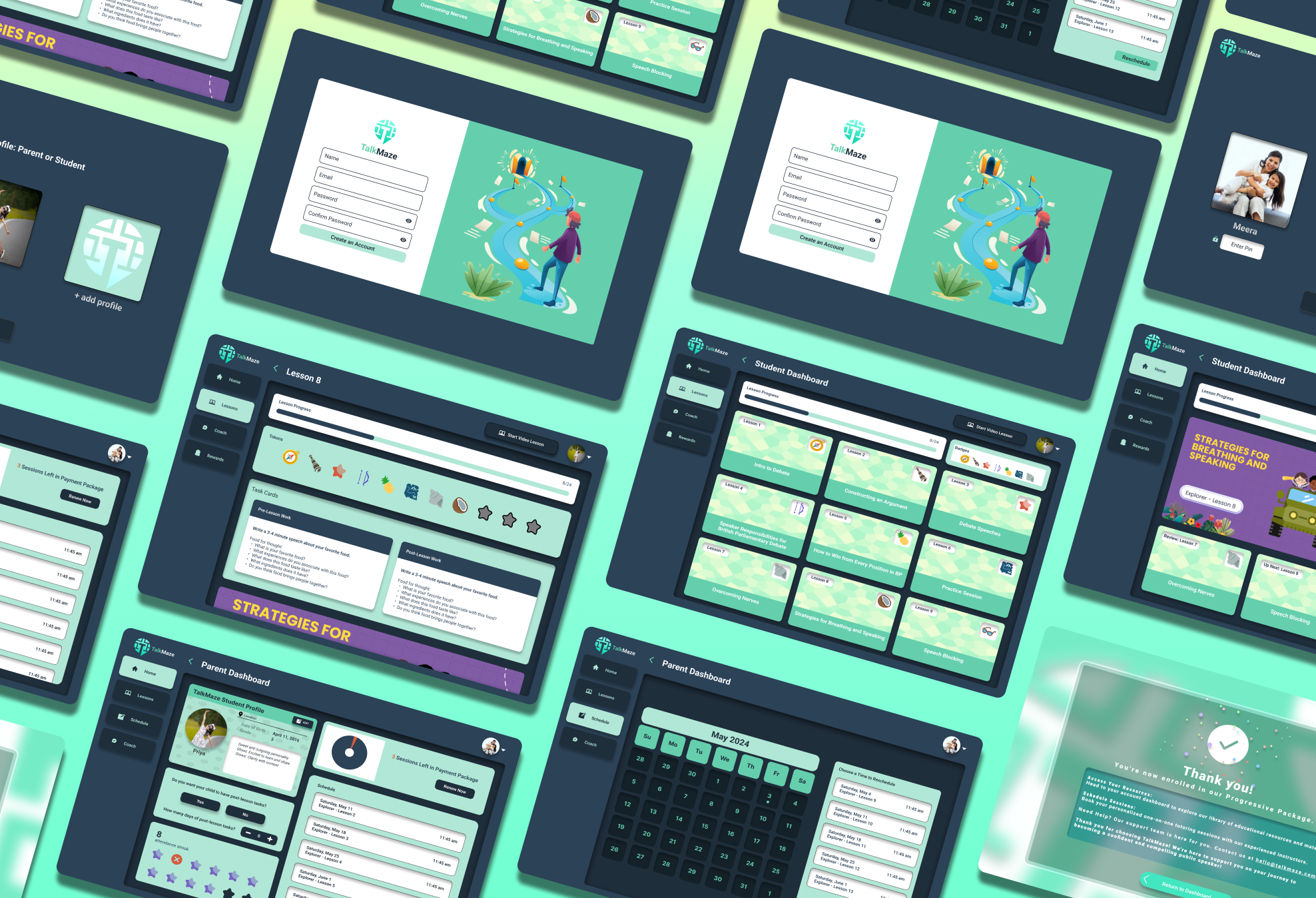
I lead the team to add final touches during this 3-week spirt. All the little details and consistent design followed through with the all-age range, and user-friendly appearance of the dashboard. The even, consistent spacing of the components creates welcoming | non-intimidating impression.

Insights
Insights
Challenges |
overall condensing so many features into one without making the user feel overwhelmed
Reflection |
While all features should be considered, there are certain features that should be prioritized over others
Next Steps (phase 2) |
Play around with implementing a light mode
Add in more features to make the interface feel more furnished


